
Padre Brewing Co.
Padre Brewing Co.
Minutes away from the golden shores of Queensland’s buzzing Miami precinct, Padre Brewing reimagines the beachside brewery.


TURN SOUND off
TURN SOUND off
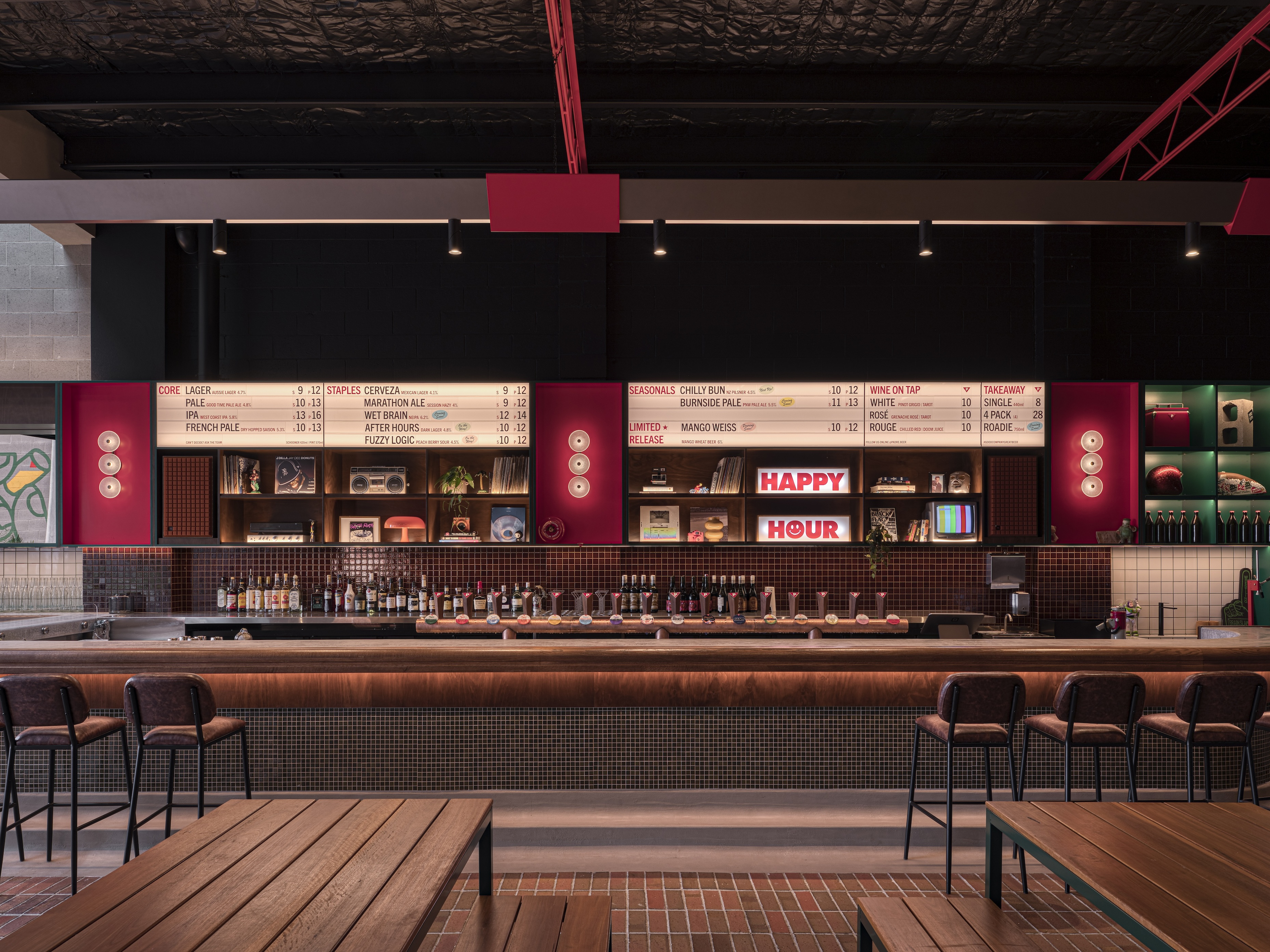
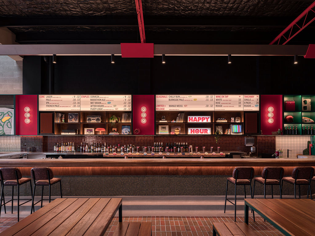
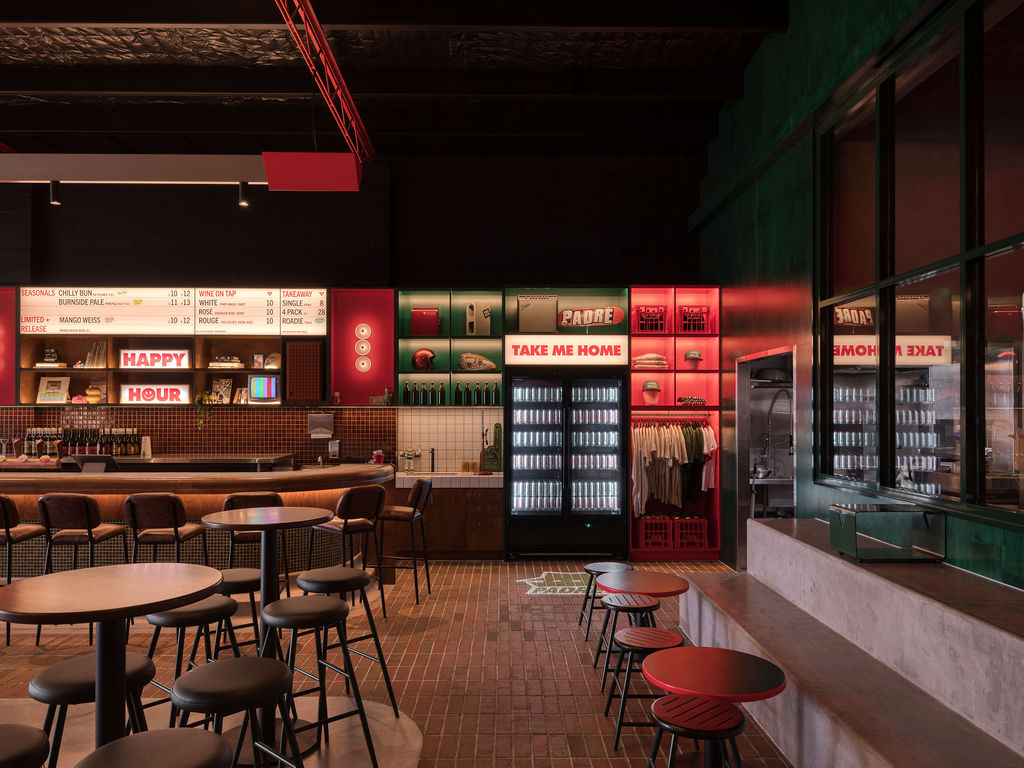
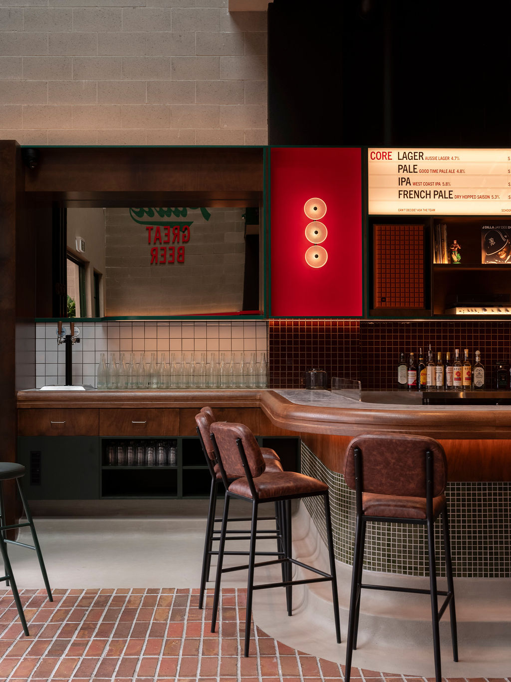
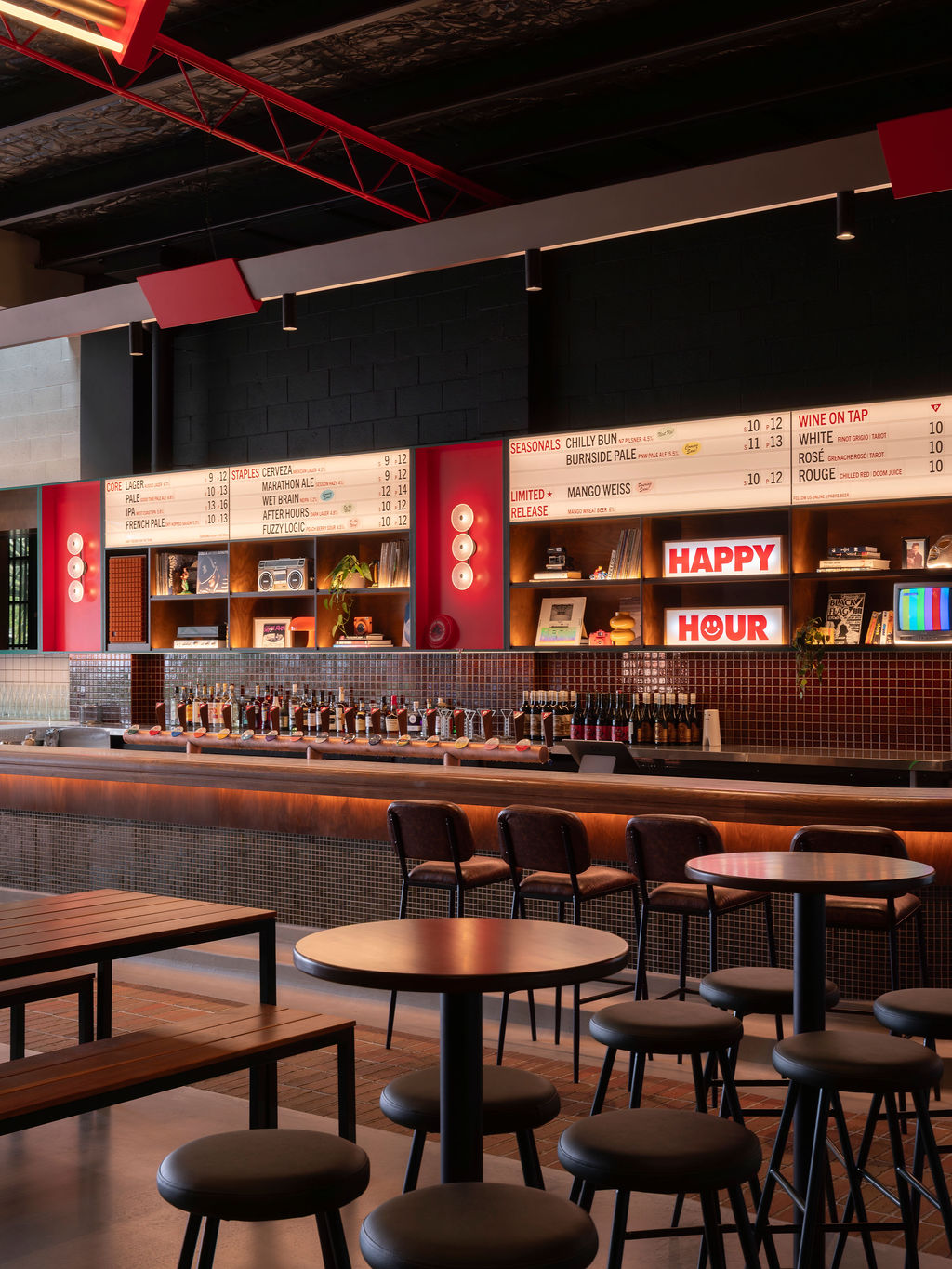
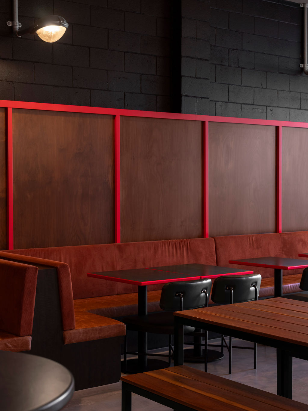
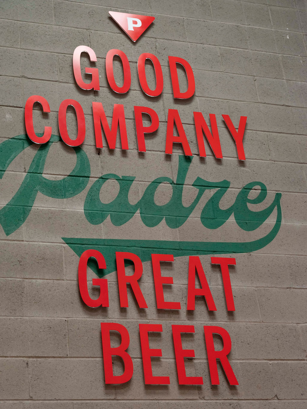
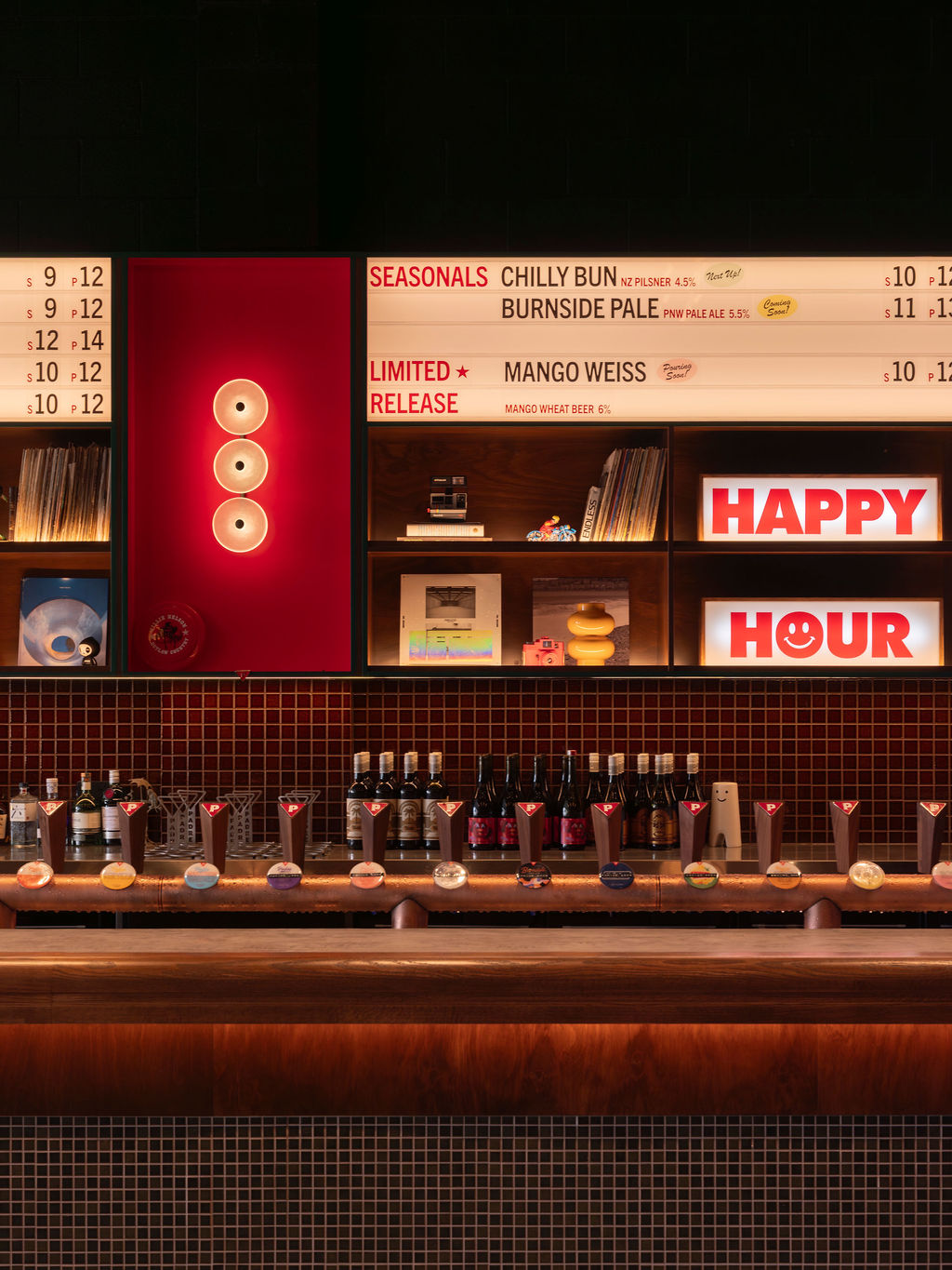
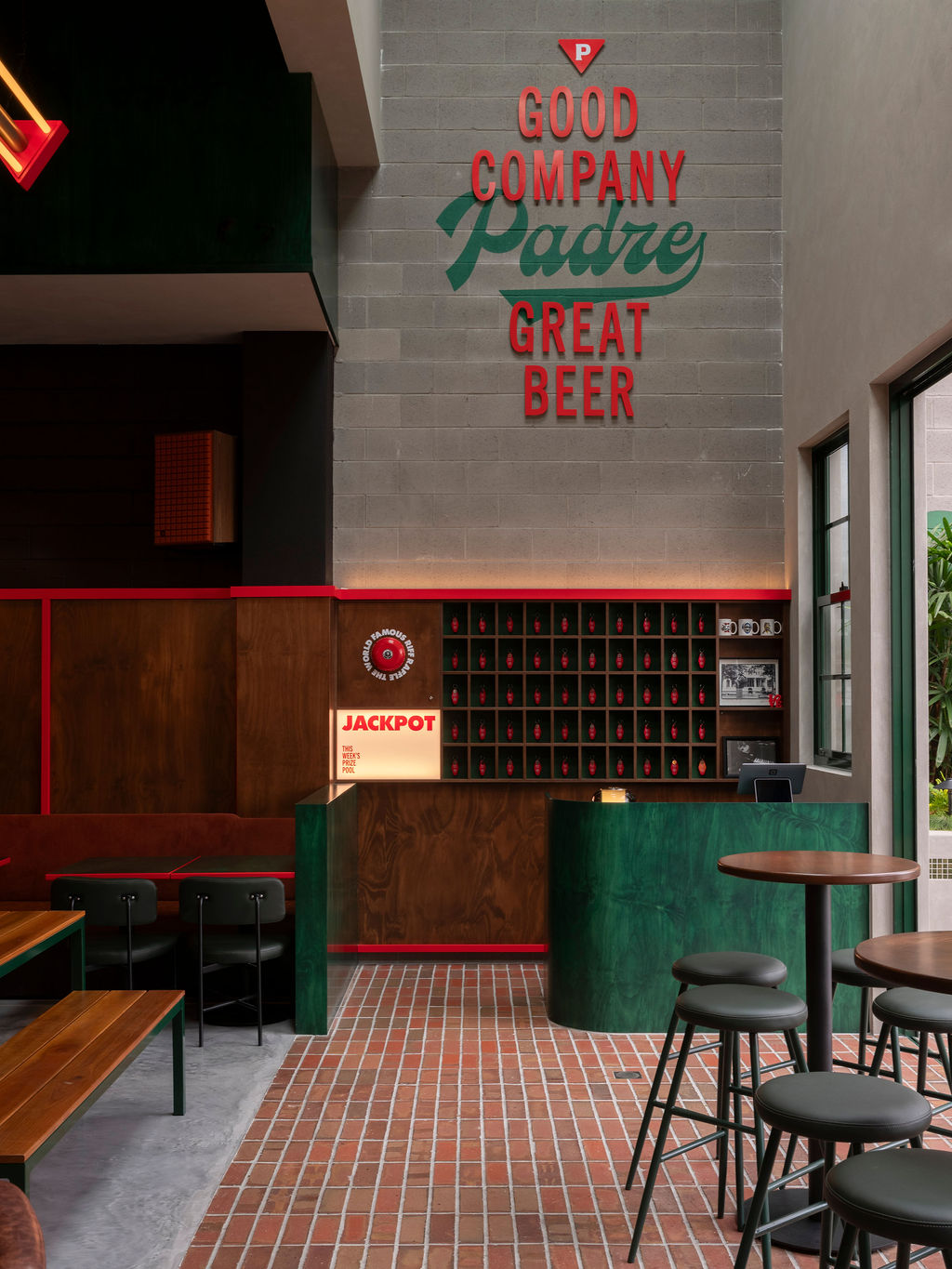
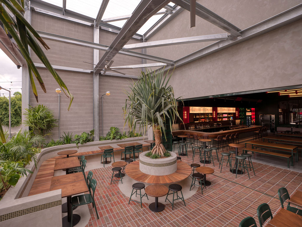
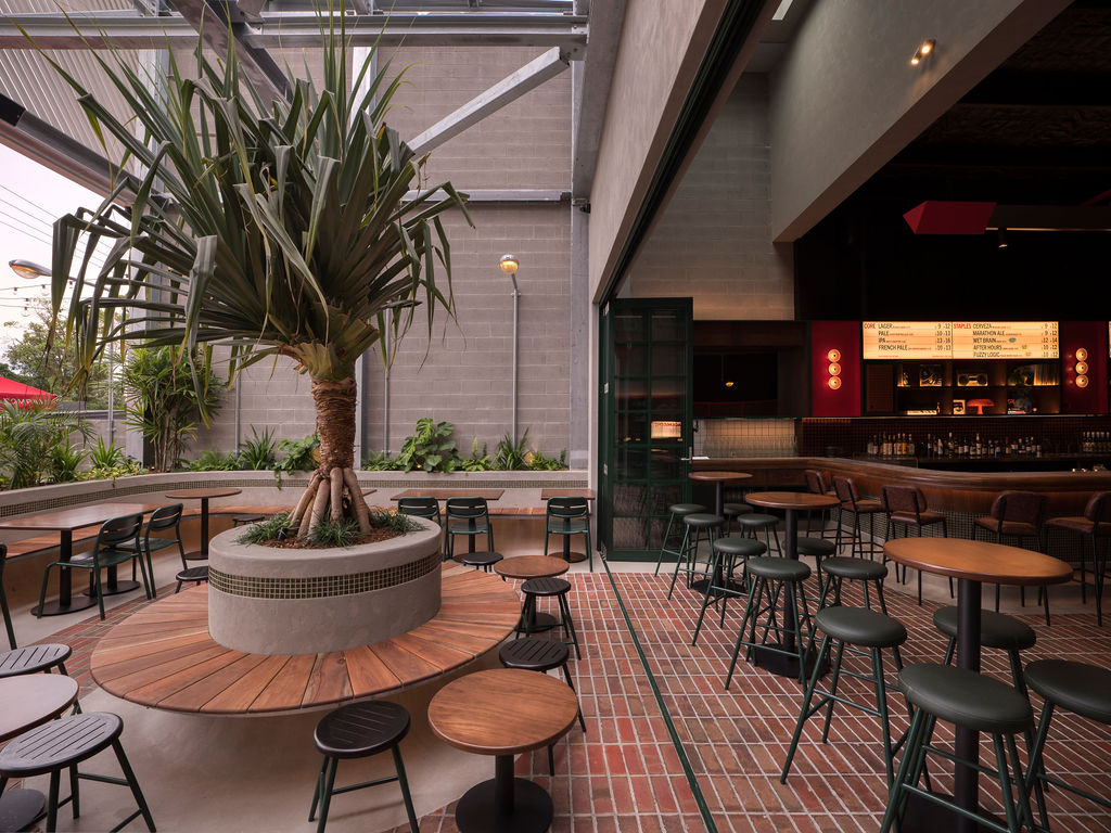
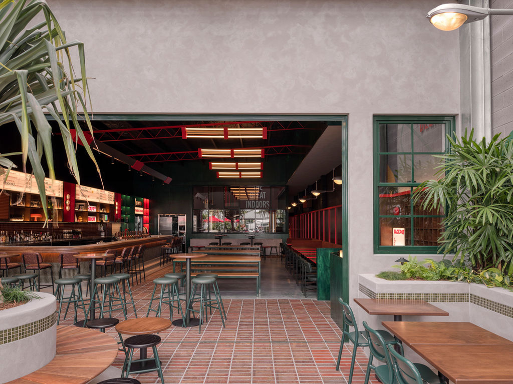
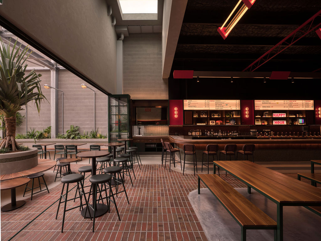
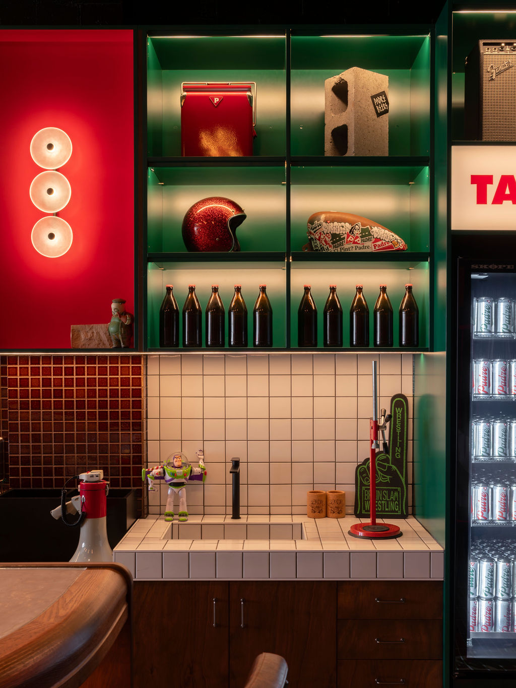
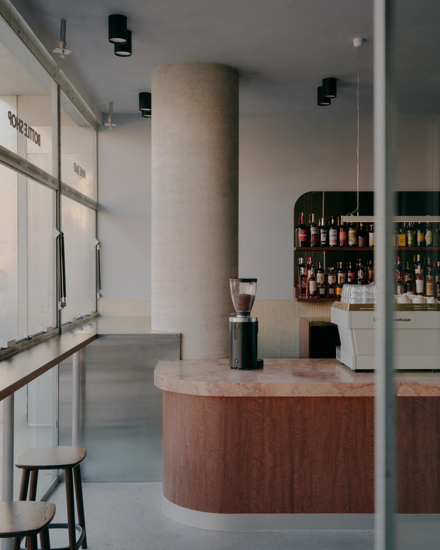
As the first consumer-facing venue for Padre Brewing Co, we sought to set the tone for how the brand would translate into a physical, experiential environment. The design ultimately champions the brand’s colours – forest green and a warm red – used liberally throughout the brewery on walls, cabinetry and furniture.
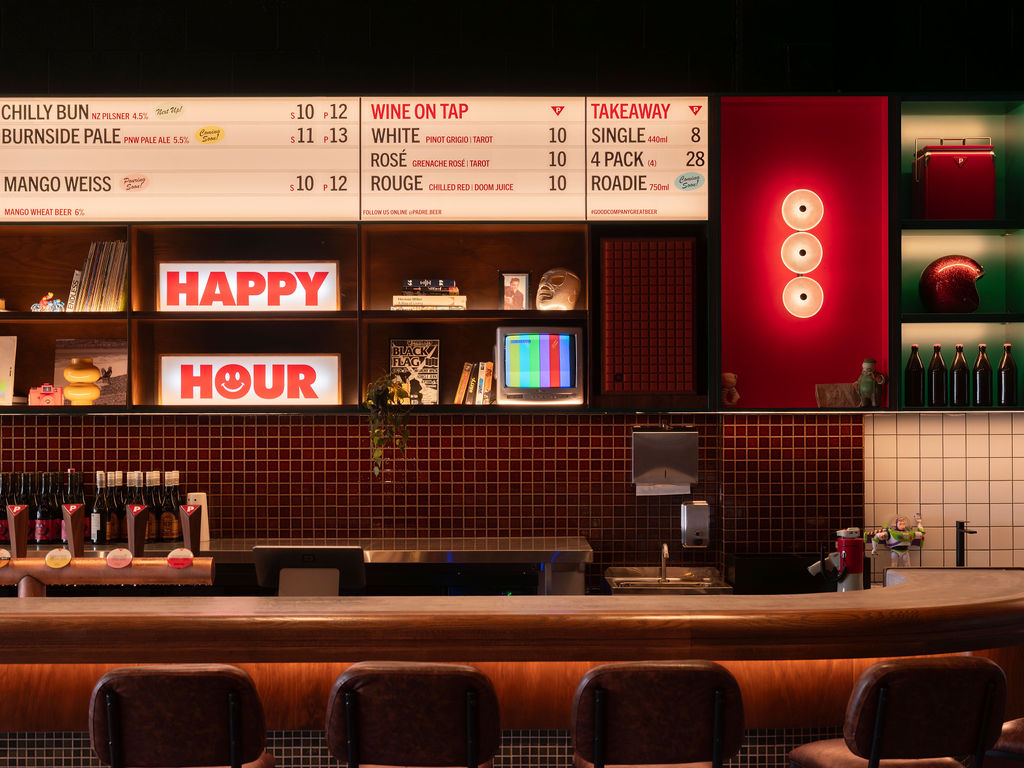
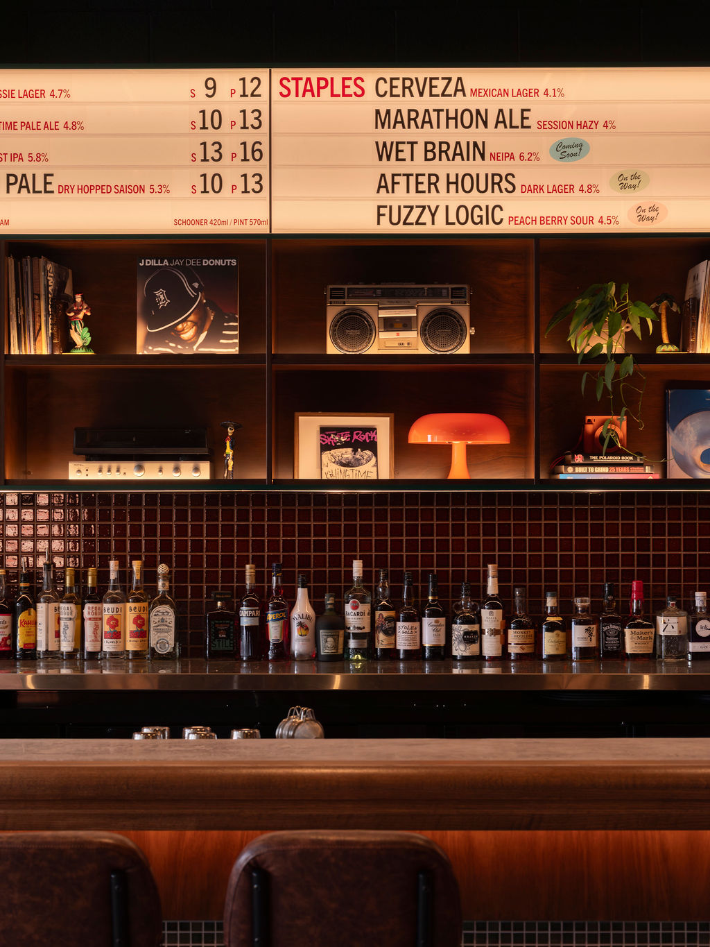
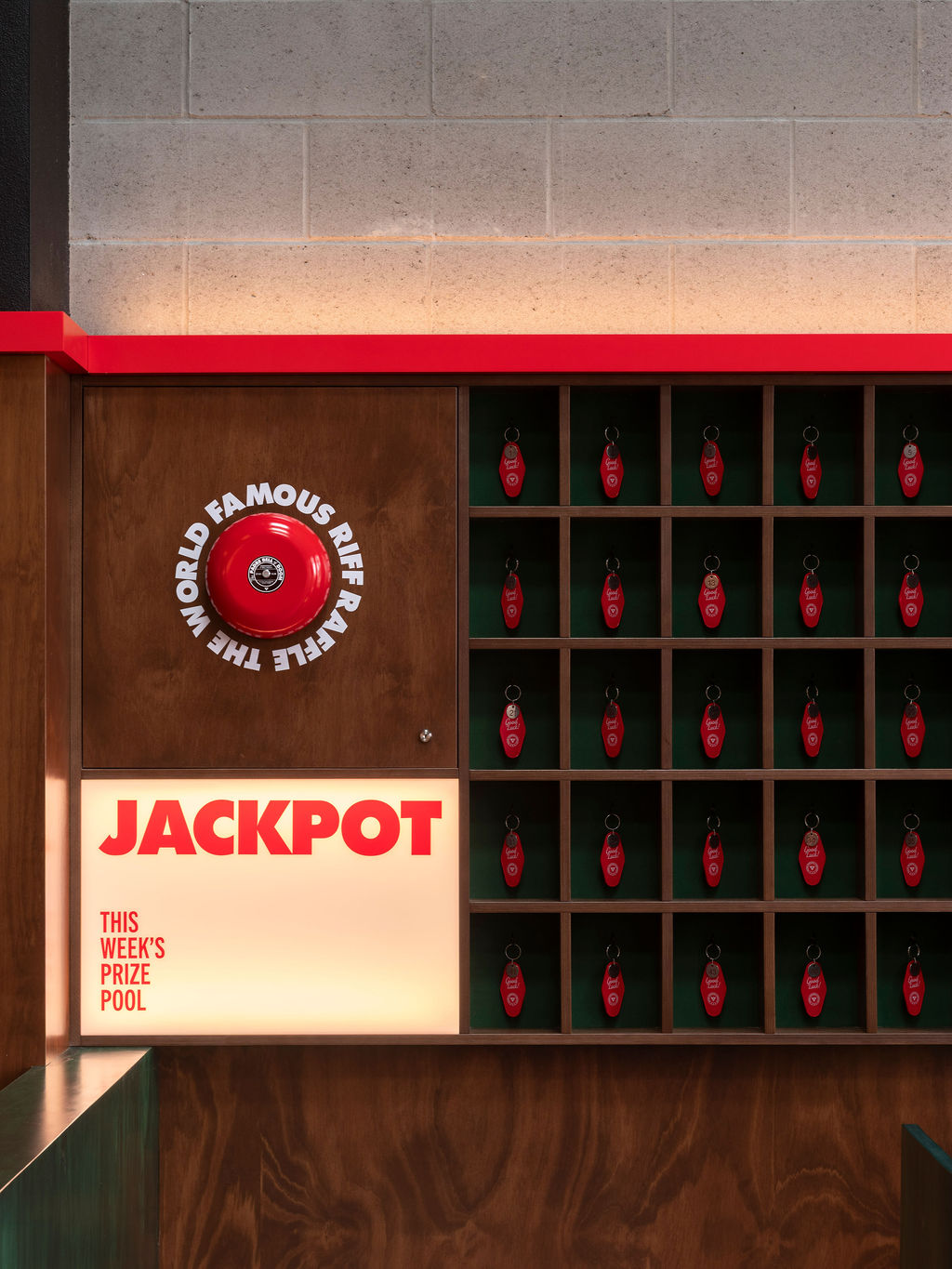
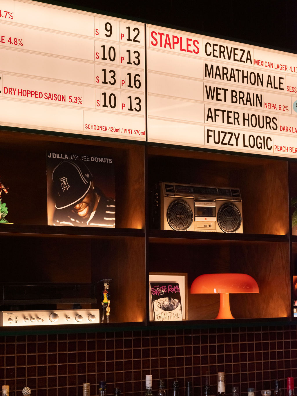
Central to the brief was a desire to celebrate the owners’ deep love for ‘90s pop culture. Above the main bar, custom shelving was installed to display their collections of nostalgic treasures (boombox, vinyl records, an original Buzz Lightyear toy); elsewhere, recesses were created to exhibit miscellanea such as raffle tokens, branded merchandise and more. We integrated light boxes to display menus, nodding to old school drive-in cinemas.
Project Info
Client name:
Location:
Size:
Project budget:
Date of completion:
Soundtrack:
Padre Brewing Co.
Miami, QLD
406sqm
$2M
Spring 2025
Collaborators
Builder:
Lighting:
Architecture:
Videographer:
Photographer:
Branding:
Kristian van der Beek
Awards
publications
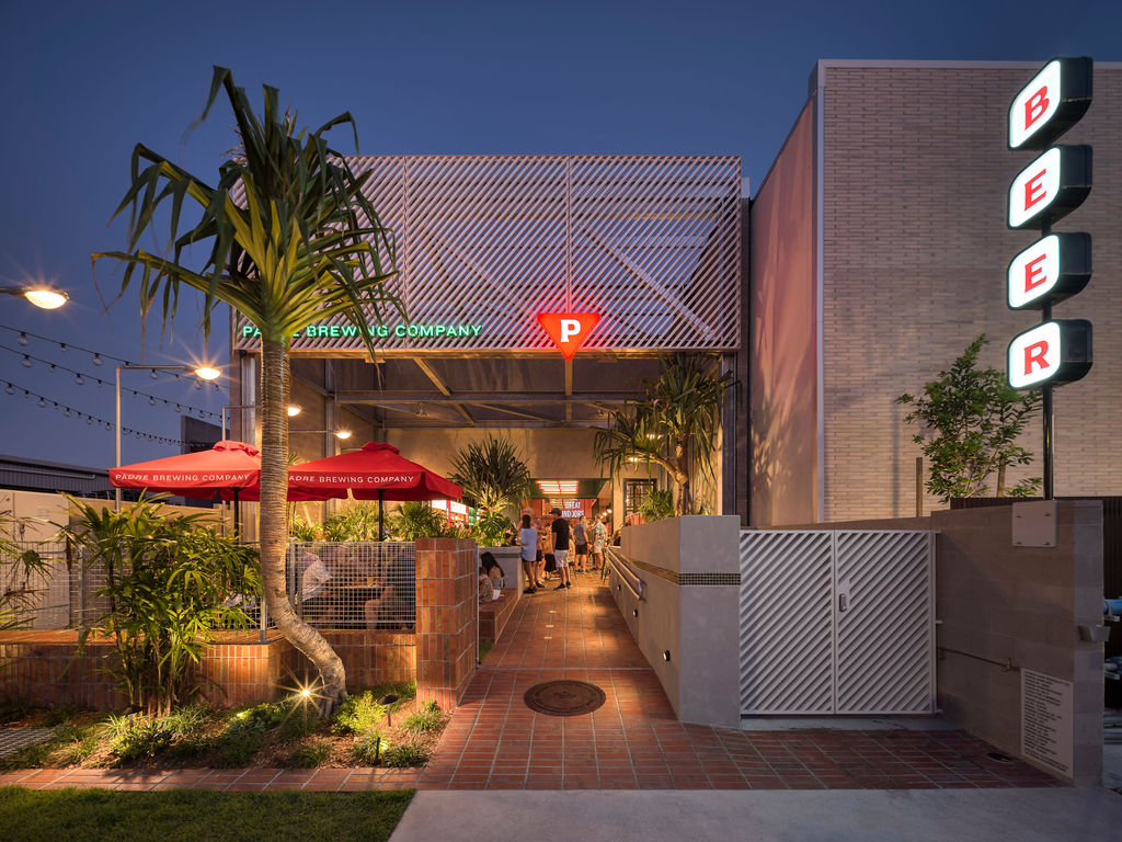
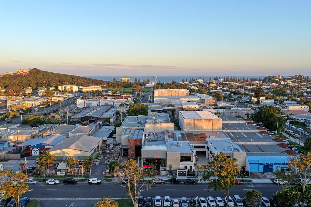
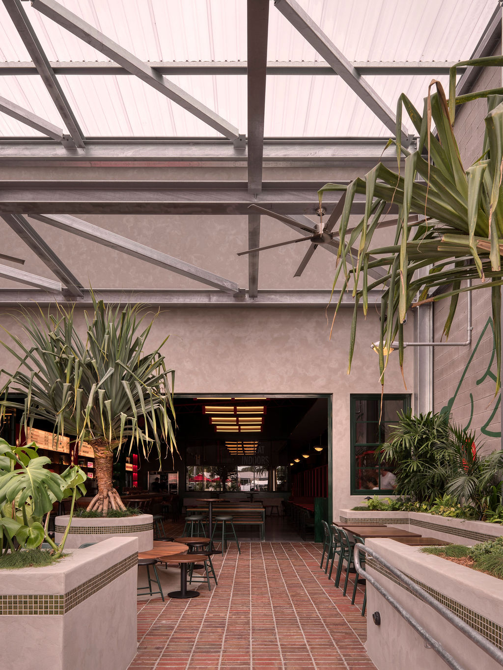
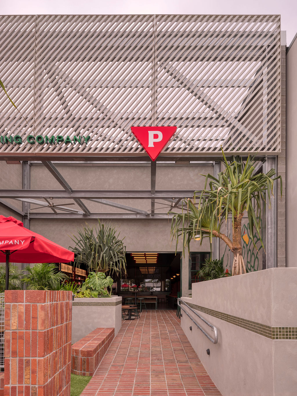
The site’s unique position on the largely industrial Ozone Parade allowed for both challenge and opportunity in connecting to the streetfront. With the brewery sitting quite recessed within a large plot of land, the challenge was to activate the street level. We introduced a welcoming forecourt that operates like a ‘front yard,’ drawing activity outward and establishing curb appeal.
The site’s unique position on the largely industrial Ozone Parade allowed for both challenge and opportunity in connecting to the streetfront. With the brewery sitting quite recessed within a large plot of land, the challenge was to activate the street level. We introduced a welcoming forecourt that operates like a ‘front yard,’ drawing activity outward and establishing curb appeal.


Partner with us
collab@studioy.com.au